
O1.M2.02. Introduction to GIS story maps
Free
About this course
Content:
Geographic Information Systems is the collection of hardware, software, output devices and practices that are used to analyze and map spatial entities and their relationships. This technology arrived in the 1960s due to the increase of (geo)spatial data that was collected about the world. GIS helps us to make maps that show objects and processes that change over time. Today we live in a world that has a superabundance of data sources that help us to collect, store, analyze and use data to produce not only traditional, but also “modern” maps. Just as we use specialized software to work with spreadsheets and do calculations with them, we use GIS applications to work with spatial (geographical) data. The GIS consists of three main components:
Digital data – the geographic information that will be visualized and analyzed with computer hardware and software.
Computer hardware – machines on which processing, visualization and storage of spatial data are performed.
Computer software – computer programs specialized for working with spatial data that run on computer hardware. Also called a GIS program or GIS application.
With GIS applications, digital maps and spatial data can be viewed, data can be modified to satisfy our needs, and maps can be prepared for paper printing.
Making maps is an essential part of contemporary geography and geospatial science. Maps are complex objects that can hold lots of information. This information can be presented in different ways and with other symbols for different users and customers. Some of that information appears in the signs, but maps impart much more subtly. Story mapping is one of the most interactive and practical ways to present geospatial data.
The concept of story mapping was created by Jeff Patton in 2008 (Patton, 2014). The concept is used to show all details that are required to deliver customer value and to reveal the experiences of the map maker for different software. In computer science, the process of story mapping is a method used to arrange different stories in order to create a holistic view of how they fit into the general experience of the mapmaker. Story mapping was also applied in GIS thanks to the ESRI (Environmental Systems Research Institute). GIS story map is a web map that has been thoughtfully created, given context, and provided with supporting information so it becomes a stand-alone resource (esri.com). Story maps could be arranged with audio or visual material that is related to the place which is (geo)tagged and our area of interest. ESRI story maps integrate different types of maps, legends, text, photos, and video and provide different functionality – swipes, pop-ups, and time sliders. These elements help users “to play” with the content. The customer experience is always different for particular travels and each story map could have different elements. Usually, those elements are arranged in chronological order based on when the user performed a particular task or visited a place during a holiday, for example.
Content:
Maps are complex as well as human map readers interpret the information. Therefore to create a (story) map that has both detailed and valuable information, we have to use GIS software, but in addition, we have to show the system how a map reader would think. By formulating a conceptual model (a picture of the map reader’s mind), we can create more precisely the way to transfer the real world into our GIS story map. The second part of the story map conept lies on storytelling as a fundamental part of human nature and contemporary education. While many people may immediately envision oral or textual stories, a variety of other approaches, including maps, can serve as powerful storytelling mediums (Strachan & Mitchell, 2014). The visual nature of maps makes them ideal for communicating geospatial stories in a new way that can engage the students. The advances in data availability and new digital technologies, including “cloud”-based data storage, have put countless maps in the hands of millions of people and have revolutionized how people create and understand map-based stories.
GIS projects start with conceptualizing the “big picture” by asking what final product needs to be done for our users. The process continues with the decomposition of the final product into the general types of (story) maps we need to use. This stage i involves determining the aspects of each map that we need to examine. This final stage defines the map elements (features, objects, details, and related data) that we plan to combine to create your final map.
Each GIS story maps project has its map elements and its own outcome. To decide what map features we need, we can draw a simple flowchart, starting with the product and then breaking it down into themes and individual elements.
Content:
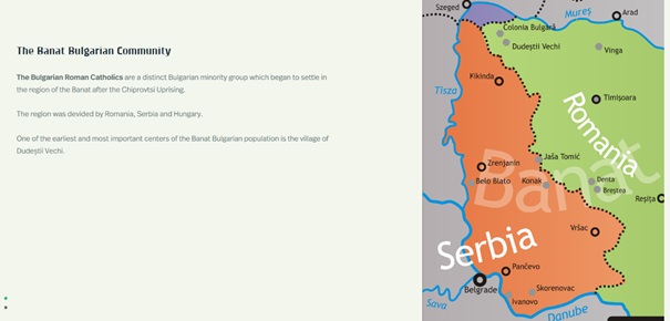
Before creating the (story) map, we first need to be aware of “the geography” we want to include. The elements that we want to put into the maps and what layers we put into the GIS determine the effectiveness of our analysis. Each particular subject has many kinds of “geography” associated with it. We might be working with economic geography, social geography, transportation geography, urban geography, physical geography, cultural geography, and many more. Each subject relates to the types of data we want to use in our projects. For example, we are using GIS to show the cultural diversity in the Vojvodina region in Serbia. We should rely on the following “geographies” of this area:
- The cultural geography: points out cultural factors – such as religious affiliation, traditions, music, food etc. in the area;
- The transport geography: shows the transportation system that people use to move in the area;
- The physical geography: helps you understand the natural landscapes of the territory etc.
Our goal is to pick the most appropriate geographies and the most useful parts of those geographies to build our GIS story map with its components that will be relevant to our users.
Content:
One of the most crucial things in the map-making process is selecting a theme for the map. One critical question is, what should we include in a GIS while making a story map? First, like with any project, we should identify the final product. Suppose we plan to use GIS to create story maps with the cultural heritage objects in Kikinda, for example. In that case, our final map should show you a list, preferably categorized, of the entity that has cultural and historical value to the society. To outline the specifications for the content of the final map, we should ask ourselves these basic questions:
- How big a piece of land do you need to show the objects?
- How many objects do we need to show on the map?
- What are the categories of the places (e.g. archeological site, historical building, sculpture etc.)?
- What other information can we include in the map (photos, audio files, videos etc.)?
- In what sequence should we order the places on our story map?
The answers to the preceding questions suggest what data we need to put into the computer GIS so that we can produce the final story map we need:
- We need a map that includes all the known cultural heritage objects so that the software can show it on the map;
- We need to know their exact coordinates (X and Y);
- We need a map (layer) that includes the status of the places;
- We can map also topography, soils, or other physical factors, and each factor provides specific information;
- We might need a map that show availability transport infrastructure systems that help us to understand what is the accessibility to the places.
The more data we have, the more different story maps we can create. We can break the final output (the story map) into the individual data component required to construct it by starting at the final product. The final goal is to specify the details by asking questions about what we need to know before visiting Kikinda and enjoying the cultural heritage of this town. After completing this process, we can translate our questions into individual mapped features that we need to answer those questions.
Content:
Geographers use two general data forms that translate the map into a digital format: raster (little squares or grid cells) and vector (or points, lines, and polygons). The raster data resemble a chessboard, while vector data resemble line drawings. Most GIS software uses both types of data. Each conceptual model base (raster or vector) brings a unique set of tools, levels of accuracy, ways of modeling, and course advantages and disadvantages.
The raster type of data, or grid cell, resembles a checkerboard or chessboard. Each square is a single grid cell, and each grid cell represents a value (that is related to that place on the Earth). When mapping, we assume that portions of the Earth are square for simplicity, and the GIS software can adjust the Earth coordinates for this assumption. Using the raster model, we can show points, lines, polygons, and volumes on the map (DeMers, 2009).
- Points: In a conceptual model of geography, points have no dimensions (length or width). If we consider raster GIS as a checkerboard, a single grid cell is a point object, such as a church, mosque, or synagogue. Each different type of place of worship, such as churches, has a unique grid cell color on the raster map that’s associated with a different number inside the computer. But, unlike a checkerboard, we can have more than two colors of squares. For example, we use the number 1 to represent churches, 2 to represent mosques, and 3 to describe synagogues. These different types of features all have something in common — each means a place of worship associated with a common theme or map layer. This standard characteristic limits the number of codes and colors we might need for your map of point features.
- Lines: In grid cell–based GIS, a string of grid cells represents a linear object (such as a road, a railroad, a river, or a biking path). This string of cells can be lined up orthogonally (edge to edge), diagonally (along the corners), or in some combination, depending on how curvy the feature is. Line objects have only one dimension (length), even though they usually have some width in the real world. So, when we use grid cells to represent lines, we have the same problem with point features – we have to use a symbol with an area to describe an object that doesn’t.
- Areas (polygons): The grid-cell system can easily represent areas. The computer symbolizes each unique place – for example, a natural park, a lake, or a protected forest as a single grid cell (if the area is small enough) or a group of grid cells. These cells may be connected (contiguous) or disconnected (noncontiguous). The size of each grid cell corresponds to a particular area of land. So, if a single grid cell corresponds to a land chunk that measures 10 m on a side, that cell represents 100 sq. m (10×10 m) of land area. Like point and line features, each area shows up on a raster map as grid cells with a standard color, shade, or pattern, and each type has a unique number inside the computer.
- Surfaces (volumes): When we are representing surfaces or their volumes, each grid cell has, in addition to length and width, a number associated with the height or depth of the space. This number may represent elevation above sea level or depth to groundwater for a point at the center of a grid cell. In some GIS, grid-cell values represent nonphysical surfaces, such as population density or land appraisals. Grid cells expressing surfaces have so many possible values that each grid cell may have a unique number. To go along with this number, we could give each grid cell an equally unique color or shading pattern on a raster map. But if we do, we soon will find that we can’t really distinguish one from the other with so many different looks. GIS software usually allows us to designate surface values by groups. For example, suppose we want to represent elevation. In that case, we might have one group of grid cells that ranges in height from 0 to 100 m, another from 101 to 200 m, another from 201 to 300 m, and so on. When we display the grid cells representing the range of values, we can distinguish among the various elevations.
In a vector-based conceptual model, representing a point, line, and area features are pretty straightforward. The vector data represents each point object by a single X and Y coordinates, each line by a set of two or more X and Y coordinate pairs, and each area by at least three lines that create a closed figure. Representing surfaces or volumes using vector data is a bit more complicated than representing points, lines, and areas, but the GIS has a well-established and commonly used data structure. This data structure, known as Triangulated Irregular Network (TIN), represents surfaces and volumes as a collection of non-overlapping triangles, similar to how computer games model 3-D objects. Each triangle’s vertices (points) have unique X, Y, and Z (height) values, but each group of three vertices creates a triangular plane whose surface has a unique angle and direction. The TIN model’s neatness is that we can use it to predict (interpolate) missing values, create cross sections through surfaces and volumes, draw contour lines, and even create 3-D visualizations.
Content:
In the past, trained cartographers in cartographic production shops made almost all the maps created. Their products were hard copy maps done on parchment, paper, or other surfaces, depending on the day’s technology. Today, large production shops are still available in government agencies or in businesses that specialize in maps. Many professional cartographers do both production and cartographic design work for GIS companies. These large shops will likely be around for some time. They can always find a market for large volumes of well-designed maps, ranging from general reference and atlas maps to content-specific thematic maps. Although the shops have staying power, their role in producing cartographic output is quickly and permanently changing because of the ready availability and rapidly increasing numbers of GIS software users.
When we work with GIS software, we are the cartographers and disigners. Unfortunately, we don’t automatically inherit professional cartographers’ training and experience because you own the latest and most fantastic GIS software. GIS software provides us access to the cartographer’s toolkit. Still, many of those tools have specialized uses that require instruction and particular conditions under which we can and should use them.
The cartographic product of our GIS work is essential. We can do the most elaborate and impressive GIS models in the world. Still, when we’re done, we need to produce a map that the user accepts and, more importantly, that precisely communicates the analysis.
Content:
Traditional maps are the most common forms of maps and are generally the most easily understood by the general public. Reading and interpreting maps is much easier if the scales, symbology, classes, and graphic design elements focus on visual communication. These principles hold for computer displays, like maps on paper, silk, papyrus, or other non-computer surfaces. There are five fundamental characteristics of good map design, known as “the cardinal rules of mapping.” (DeMers, 2009):
- Make sure that the map meets users’ needs. Always make this characteristic rule number one. If the user can’t interpret the map or the map presents the wrong information, all your time and the results of your analysis are wasted.
- Make the map easy to use and understand. Avoid confusion at all costs.
- Accuracy is essential to good map design. As much as possible, avoid data errors, unintended data and graphic distortions, and misinterpretations.
- The method of map presentation should relate correctly to the data. Make sure that you use the right type of map – one with the right symbols, correct classes, scales, projections, and so on.
- Allow the user to review and interact with the map during production. Make sure the user understands what the map is all about, that it meets his or her needs, and that it communicates the information correctly.
The ultimate goal of GIS is to communicate results. Many people are familiar with lists, tables, statistics, travel directions, and other non-map-like forms of communication. Suppose the intended recipients of your GIS output are more comfortable with these alternatives to maps. Why not provide them with these forms of communication rather than or, at least, in addition to cartographic output? GIS has many ways to communicate results that are not purely cartographic. In addition to generating maps, a GIS can present virtually any of its data as statistical tables or graphical charts and diagrams. We have a staggering volume of potential output GIS output that works well in non-cartographic formats.
Content:
Story maps would not be possible without newer, faster computers and better graphics output devices. With those innovations, GIS has a new set of possibilities for presenting geographical data and using it for analytical results. Animations and flythroughs are tools that involve the development of short movie clips. These types of video output give GIS users a different perspective on the data.
GIS animations are a form of geographic visualization that shows dynamic changes to a single map layer or even multiple map layers simultaneously to allow visual comparisons. We commonly use GIS animations to depict geographic movements (for example, tracking the activity of wildlife) and temporal changes (such as changes in land cover patterns over many years). Animations show changes – which might take days or weeks – at a fast pace so that we can see trends you might otherwise miss. Alternatively, suppose we have a lot of data about changes that occur quickly. In that case, we can use animation to present those changes slowly and, again, identify changes we might not otherwise catch. Some circumstances might warrant moving through an animation backward and forward so that you can focus on specific events in the sequence.
Here are several possible uses of animations in GIS:
- Tracking hurricanes and other weather-related phenomena
- Keeping tabs on the movements of delivery trucks that have built-in GPS units
- Watching changes in climatic data, such as temperature, pressure, and precipitation, over months or even years to observe climate change
- Viewing airline flights to detect possible locations for high traffic concentrations and potential accidents
- Tracking radio-collared wildlife species to identify habitat preference
- Examining land-use change through time to determine major trends
- Observing how crime hot spots change throughout the day, during the week, or even at different seasons
- Watching changes in market share of your own and competing businesses to identify where new businesses are impacting your sales
We should use GIS data presented as animations when we want to focus on pattern changes or feature movements through time.
Another form of an animated map is the flythrough. This is a form of animation that happens in three dimensions. It allows us to fly through a three-dimensional version of the map visually. We can find a typical example of flythroughs in software such as Google Earth. Still, most professional GIS packages also possess this capability and give you total control over how the flight moves. We can control the flight path or track, perspectives, and camera locations of the flythroughs in two ways:
- By setting up a sequential path: We select several key locations we want to visit in the sequence we want to view to create the general flythrough path.
- By recording your movements during a flight simulation: We control the speed of the flythrough based on the rate at which you move during the recording process.
Whether we set up a path or use the simulator approach, the software records a sufficient number of frames per second so that it moves smoothly when the flythrough is played back. GIS flythrough is helpful for the following GIS applications:
- Terrain evaluations: To detect landscape features or compare terrain texture (ruggedness or smoothness);
- Urban impact assessment: To show the effect of urban structures on wind;
- Political and cultural studies: To illustrate the often radically different patterns that occur as you cross political boundaries worldwide;
- Damage estimation: In which flying through an entire valley allows you to observe flood conditions;
- Ecological research: Making visual comparisons of elevation levels to changes in the size and composition of vegetation.
Vendors usually save flythrough animations in some proprietary format. Still, in most cases, we can export flythroughs as Audio Video Interleave (.avi) or Quicktime (.mov) files that we can play back to relatively quickly. We can use flythroughs when we need multiple views of a topographic feature or when we want to see the relationships that might exist between elevation and other features on the surface.
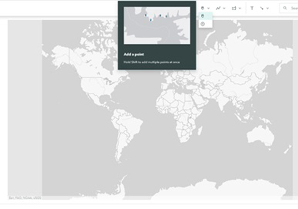
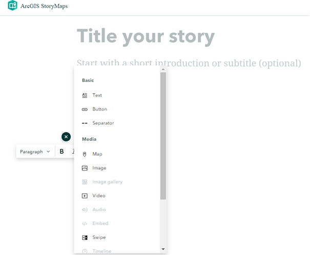
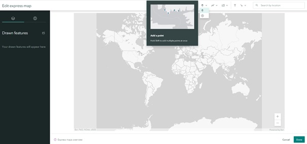
The map-making process is straightforward. ESRI, a globally recognized supplier of Geographic Information Systems (GIS) software, has increasingly been focusing its efforts on developing web-based GIS. With ArcGIS Online, ESRI’s web-based mapping platform, users can easily create, access, and share data, maps, and applications in the cloud (Strachan & Mitchell, 2014). The company provides templates that can be used to satisfy our needs. You can publish a story map using the templates without writing any code. You create a web map, supply the text and images for the story, and configure the template files provided according to the instructions in the download. When logging in ESRI cloud the story map starts with very simple interface (fig. 1)
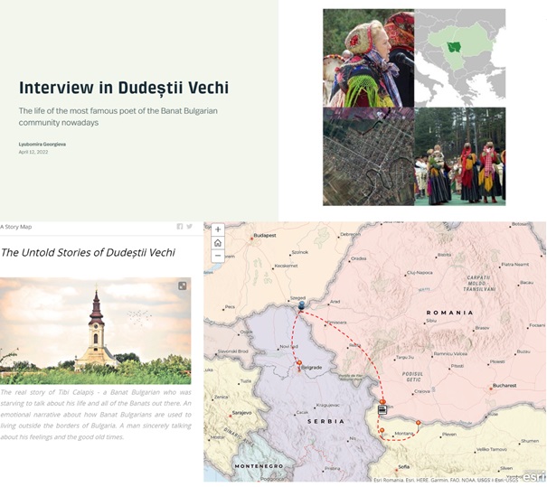
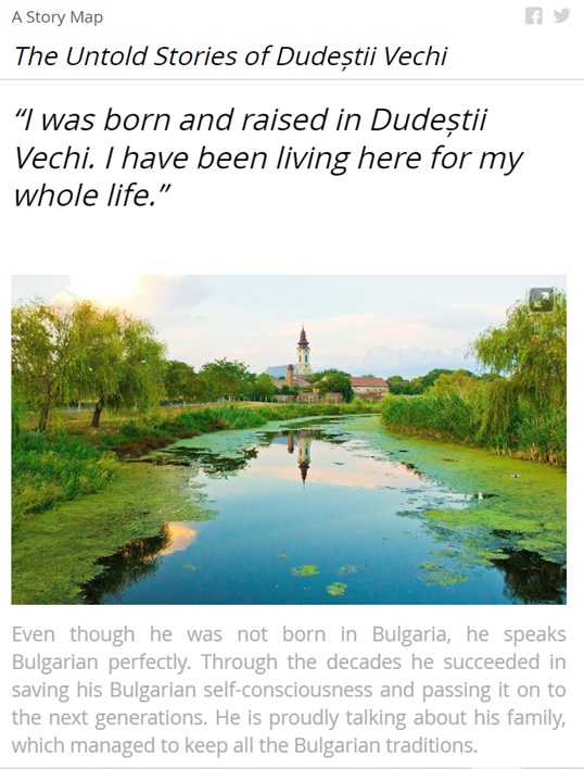
While designing the story map, we can also emphasize a particular message we want to address. In that case, we wanted to highlight the role of invisible cultural heritage and the traditions transmitted from generation to generation. The screenshot captures the Catholic Church liturgy dedicated to St. Lazarus day, one week before Easter (fig. 6).
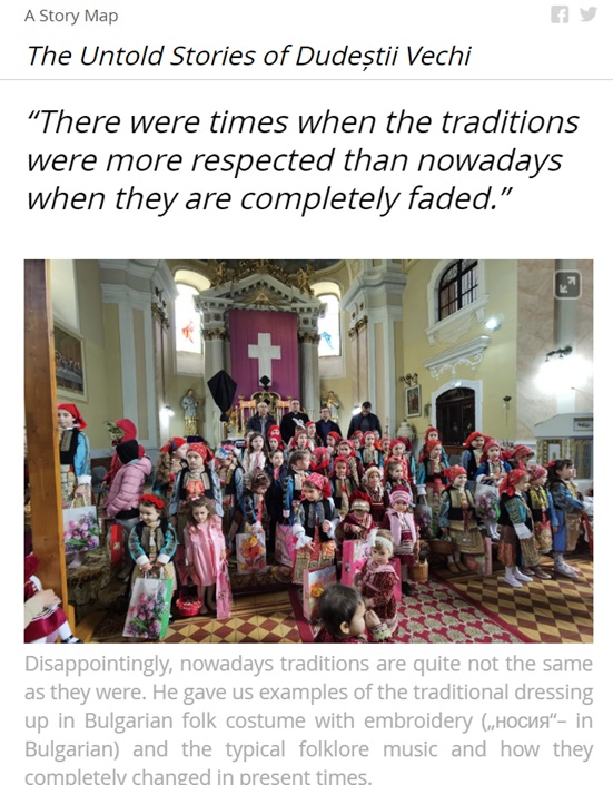

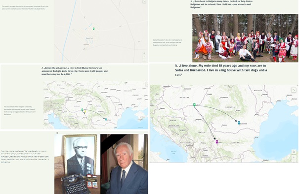
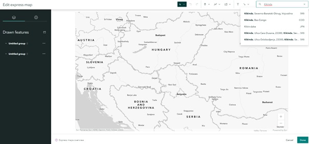
Figure 10 Interface of ArcGIS Story map
Figure 11 Sharing the final product
The story map concept allows students with varying levels of GIS and mapping experience (from none to substantial) to clearly express the spatial story attached to their projects (Battersby & Remington, 2013). On the other hand, they let teachers introduce students to the concepts and techniques involved with creating a dynamic, geocentric web application. Story maps are created using basic prepared templates. They are designed entirely using the ArcGIS Online cloud platform tools.
They also can be made from downloadable template files that are easily configured and customized by editing a few simple HTML or comma-separated value (CSV) files. While incorporating story maps was an overall success, it was a learning experience with technical challenges for students, the instructor, and the technical staff supporting the class. Working with ArcGIS Online and story maps provided great opportunities to introduce students to web-based mapping and multimedia technologies. The story map concept enabled students with all levels of GIS experience to create professional-looking dynamic web map applications to support and present the research from their class projects (Battersby & Remington, 2013).
References
- Battersby, S. & K. C. Remington (2013). Story Maps in the Classroom. https://www.esri.com/content/dam/esrisites/sitecore-archive/Files/Pdfs/library/ebooks/arcgis-online-in-education.pdf
- Brand, Brenda R., and Cheri F. Triplett. (2012). “Interdisciplinary Curriculum: An Abandoned
- Concept?” Teachers and Teaching 18 (3): 381–93.
- DeMers, M., (2009) GIS For Dummies. Wiley.
- Duke, Barbaree. (2013). “Story Maps #3: Using Esri’s Story Maps to Address Common Core
- Esri. (2013). “ArcGIS Online in Education: Success Stories from Early Adopters.”
- Reading Standards”. WordPress. Creative Curriculum Integration and GIS in Education.
- Gregory, D. (eds.). (2009). Dictionary of Human Geography, fifth edition. Blackwell.
- Haggett, P. (2001). Geography, a Global Synthesis. Pearson education.
- Harmon, J. & S. Anderson (2003). The Design and Implementation of Geographic Information Systems. John Wiley & Sons.
- Hong, J. (2014). Promoting Teacher Adoption of GIS Using Teacher-centered and Teacherfriendly design. Journal of Geography 113(4): 139-150.
- Parida, P., A. Sahoo and B. Mohanty (2019). GIS applications in fish disease mapping and forecasting. In: Advances in Fish Research, Vol.-VII, Pages 355–369 Edited by: B.P. Mohant. Narendra Publishing House, Delhi, India.
- Patton, J. (2014). User Story Mapping: Discover the Whole Story, Build the Right Product. ISBN-13: 978-1491904909
- Rogers, E.M. (2003). The Diffusion of Innovations. 5th ed. New York: The Free Press
- Strachan, C & J. Mitchell (2014). Teachers’ Perceptions of Esri Story Maps as Effective Teaching Tools. Review of International Geographical Education Online RIGEO Vol. 4, Number 3.
- https://www.arcgis.com/apps/MapJournal/index.html?appid=880280f004e947bcb3a7777749d2e3f1
- http://www.eo4geo.eu/training/urban-heat-islands-basic-gis-knowledge-vector-and-raster-data/
- https://www.productplan.com/glossary/story-mapping/
- https://www.esri.com/en-us/arcgis/products/arcgis-storymaps/product-road-map
- https://www.esri.com/about/newsroom/arcuser/what-can-you-do-with-a-story-map/
- https://www.esri.com/en-us/arcgis/storytelling-solutions
- https://storymaps.arcgis.com/stories/8b6b0c0ea9f44a139408cf09ef74397b
- https://storymaps.arcgis.com/stories
- Story map made by Irena Georgieva, Tsvetina Buzova, Lyubomira Georgieva, Ziyatin Isufov
- Story map made by Kristian Kirilov, Mihaela Petrova, Borislava Filcheva
Other Instructors


Syllabus
The aim of this class is to make students familiar with the Traditional approaches in the Geography of cities. This will help students gain important knowledge in the evolution of different approaches in Urban Geography
O1.M2 OBJECTIVE AND SUBJECTIVE SKILLS IN INTERPRETING TERITORIAL NETWORKS
O1.M2.02 Introduction to GIS story maps
Type of format
Lecture & Workshop
Duration
Section 1 - 45 min lecture Traditional approaches in the Geography of cities. Regional geography of cities, Cultural-historical-morphological approach, Functional approach, Comperative approach 15 min break Section 2 - 45 min lecture. Regional-economic approach, applied geography approach, Critical geography of cities and conflict research, Structural-theoretical system approach, Cultural urban research 15 min break 40 min workshop (case study) 20 min final discussion
Possible connections (with other schools / presented topics)
UAUIM O1.UAUIM01 / Grid and border as instruments of planning and criticism in architecture O1 M2. 03. Process vs Object. Working with post industrial communities
Main purpose & objectives
The main purpose of this class is to make students familiar with the nine different approaches in the scientific discipline Urban Geography (Geography of cities). Important objective is to point out that there is no one dominant research approach. Another objective is to emphasize on the fact that the city can be analyzed from a historical-morphological, sociological or anthropological perspective, as well from structuralist or economic aspects. Another objective is related to the fact that they those approaches may co-exist in one study in combination because of the interdiscilinariry of the Urban Geography and at the same time the complexity of cities.
Skills acquired
The ability to think critically when studying the approaches in Urban Geography. Another skill that will be leartn is related to analyzing and organizing empirical material from the case study.
Contents and teaching methods
All of the above-mentioned sessions will be based on a dynamic combination of lectures with a hands-on approach in the several workshops for each topic.
Reviews
Lorem Ipsn gravida nibh vel velit auctor aliquet. Aenean sollicitudin, lorem quis bibendum auci elit consequat ipsutis sem nibh id elit. Duis sed odio sit amet nibh vulputate cursus a sit amet mauris. Morbi accumsan ipsum velit. Nam nec tellus a odio tincidunt auctor a ornare odio. Sed non mauris vitae erat consequat auctor eu in elit.
Members
Lorem Ipsn gravida nibh vel velit auctor aliquet. Aenean sollicitudin, lorem quis bibendum auci elit consequat ipsutis sem nibh id elit. Duis sed odio sit amet nibh vulputate cursus a sit amet mauris. Morbi accumsan ipsum velit. Nam nec tellus a odio tincidunt auctor a ornare odio. Sed non mauris vitae erat consequat auctor eu in elit.